 Scis
ScisType
Type in Scissor stays live. You can re-edit the words, the font and the spacing at any point, and the text is drawn straight onto the canvas as you type, so what you edit is what prints and exports.
The shortcuts below are written in their macOS form. On Windows, read ⌘ as Ctrl, ⌥ as Alt and ⇧ as Shift.
The type tools
The type tools share one slot in the toolbar. Pick the slot and hold to choose among them, then work on the canvas.
| Tool | Shortcut | What it does |
|---|---|---|
| Type Tool | T | Click for point type, drag for a rectangular frame of area type |
| Area Type Tool | Drag out a frame and type into it | |
| Type on a Path Tool | Click a path to run type along it | |
| Vertical Type Tool | Sets upright characters into columns | |
| Glyph Edit Tool | ⇧T | Moves, resizes and turns one character at a time |
To edit type that is already on the page, click it with any of the type tools except Glyph Edit to put the cursor in it, or double-click it with the Selection Tool (V). Press Escape, or click away, to stop editing. With the plain Type Tool, clicking an open path attaches type to that path rather than starting a new block, so you do not always need to reach for the dedicated Type on a Path Tool.
Point, area and path type
Text can sit in the document three ways, and the difference is how the lines are measured and where they break. All three stay editable, take the same Character and Paragraph settings, and can be turned into outlines later.
Point type
Click once with the Type Tool and type. The text grows from that single point and only breaks where you press Return: there is no frame to wrap against. Reach for point type for headings, labels, a few words of display type, or anything you will position by eye rather than pour into a column. Its indents and paragraph spacing have nothing to measure against, so those controls have no effect on point type; alignment is taken from the anchor you clicked.
Area type
Drag out a rectangle with the Type Tool or the Area Type Tool and the text wraps to fit the frame, breaking lines automatically at the right-hand edge. Use area type for body copy, captions, or any run of text that has to stay inside a set width. When there is more text than the frame can hold, the surplus is hidden and the frame is marked as overflowing; make the frame larger, shrink the type, or thread the overflow into another frame (see below). Indents, first-line indent, space before and after, and hyphenation all apply to area type.
Type on a path
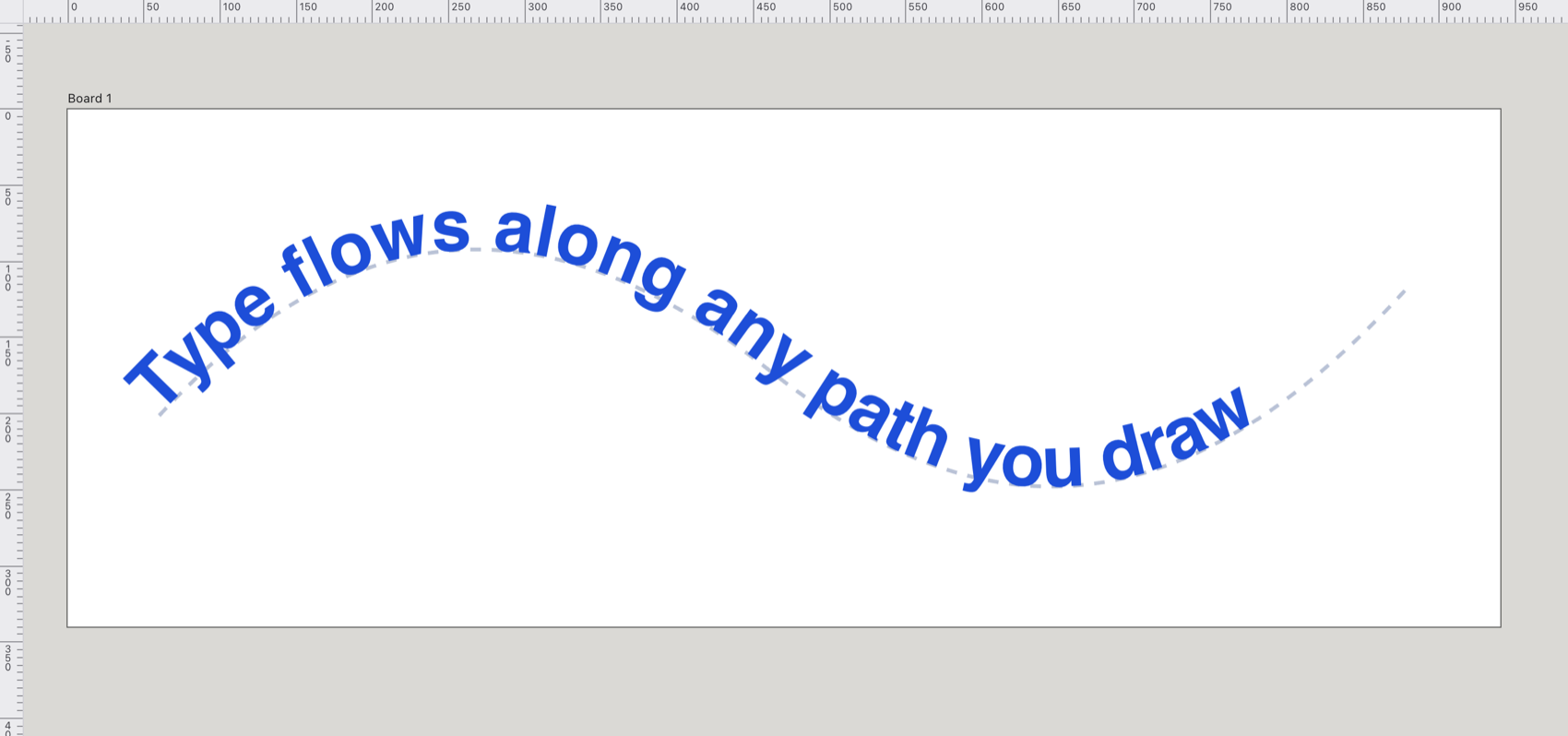
Click a path with the Type on a Path Tool. The path becomes the baseline and stops being artwork in its own right, so it is no longer filled or stroked. Reach for this to run a label around a badge, along a curve, or over the top of a shape. Select the result and three brackets appear: one at the start, one at the end and one in the middle. Drag the start or end bracket to move where the type begins and ends along the path, drag the middle bracket to slide the whole run along, and drag the middle bracket across to the other side of the path to flip the type over. Type on a path takes no line breaks, so Return does nothing while you edit it. Reshape the underlying path and the type follows its new bends.
The Character panel
The Character panel (⌘T, or Window > Type > Character) holds everything that applies to the letters themselves. Its settings cover the whole type object: change the font or the tracking and every character follows. The panel greys out until you are editing type or have a type object selected.
Font, weight, style and size
The font menu is searchable and keeps the families you have used recently at the top. It lists the fonts your browser can actually draw with, read from the system where it will report them and otherwise probed from a set of common families, so the list matches what will render rather than a fixed catalogue.
The weight menu offers Light, Regular, Medium, Semibold, Bold and Heavy, but only the weights the chosen family really has are selectable: the others are dimmed. The italic button next to it switches the slanted style on and off. Size is set in pixels, from the Size field.
Leading, tracking and kerning
- Leading
- The distance from one baseline to the next, in pixels. Leave it at 0 for automatic leading, which is 120% of the size. Set it larger to open the lines up, or smaller to tighten a heading.
- Tracking
- Even spacing added to or taken from every character, measured in thousandths of an em (so it scales with the size). Positive values loosen the text, negative values tighten it. Reach for tracking to fit a line to a width or to space out small caps.
- Kerning
- The font's own pair-by-pair spacing between particular letters, such as the gap under a capital T. It is on by default, on the Kerning button in the OpenType row (marked AV). Turn it off to see the font's raw metrics.
Alignment
The Character panel has four alignment buttons: left, centre, right and justify. Left and right are relative to the reading direction, so they mean start and end: right-to-left text set to left aligns to the visual right. Justification spreads each line to fill the measure, so it only changes anything where lines wrap, which means area type and text on a path rather than single-line point type. For the finer justification controls (how the last line is set) use the Paragraph panel.
OpenType features and small caps
Under the OpenType heading is a row of buttons, each of which flips one feature of the selected type on or off:
| Button | Feature |
|---|---|
| fi | Standard ligatures (on by default) |
| st | Discretionary ligatures |
| TT | All caps |
| Tᴰ | Small caps |
| T¹ | Superscript |
| T₁ | Subscript |
| ½ | Fractions |
| 1ˢᵗ | Ordinals |
| 𝒜 | Swash |
| AV | Kerning (on by default) |
All caps draws every letter as a capital without changing the underlying text, so it is still lower case when you edit it. Small caps asks the font for its small-capital forms. Superscript and subscript draw the affected characters smaller and shift them off the baseline, for footnote markers, ordinal endings or chemical formulae.
Below the buttons, the figure-style menu chooses how numerals are set: Default, Tabular Lining, Proportional Oldstyle, Proportional Lining or Tabular Oldstyle. Tabular figures all take the same width, so columns of numbers line up; oldstyle figures have ascenders and descenders that sit better in running text.
Not every feature can be previewed on the canvas. Ligatures on or off, kerning, caps, small caps and super- and subscript are drawn as you edit. Discretionary ligatures, the figure styles, fractions, ordinals and swash are recorded on the type and written into the exported .svg as font feature settings, but the canvas does not show them, so treat those as export-time settings.
The Paragraph panel
The Paragraph panel (⌥⌘T, or Window > Type > Paragraph) controls how whole paragraphs are set. As with the character settings, these apply to every paragraph of the type object.
Seven alignment buttons run across the top. The first three are plain left, centre and right. The next three justify the body of the paragraph and set only the last line, aligned left, centred or right. The last justifies every line including the last one, stretching it to the full measure. Justification needs somewhere to wrap, so it takes effect in area type, not in point type.
Below the alignment buttons are the indents: Left and Right pull the whole paragraph in from the sides of the frame, and First indents only the first line. A negative first-line indent hangs the first line out past the others, which is how you make a hanging indent. The Before and After fields add space above and below each paragraph, a cleaner way to separate paragraphs than an empty line. The Hyphenate switch lets long words break across lines to even out the right-hand edge. Indents and spacing apply to area type; point type is set from its own anchor.
The Glyphs panel
The Glyphs panel (Type > Glyphs, ⌥⇧F11) lists the characters of the current font by set, from Basic Latin through Greek, Cyrillic, Hebrew, Arabic, punctuation, currency, arrows and more, and keeps the ones you have used recently at the top. Reach for it to insert a character your keyboard will not type, such as an arrow, a currency sign or an accented letter. Double-click a glyph to type it at the text cursor. With no cursor in any type, the glyph is copied to the clipboard instead, so you can paste it elsewhere.
Vertical and right-to-left type
Scissor can set text down the page as well as across it, and can lay out scripts that read right to left. Both work in point, area and path type, and the on-canvas editor follows the same direction as the finished artwork.
Vertical type
The Vertical Type Tool sets upright characters that stack downwards, with each new line forming a column to the left of the last. In a vertical area frame, a column wraps to a new one when it reaches the bottom. To switch text you have already set between horizontal and vertical, choose Type > Type Orientation > Horizontal or Vertical.
Right-to-left and Arabic
The Character panel's direction menu offers Auto, Left to Right and Right to Left. On Auto the direction is read from the text itself, from its first strong character, so Arabic or Hebrew flows right to left without your setting anything. Arabic letters take their joined forms, and a run of Latin words inside a right-to-left line keeps its own left-to-right order. Set the menu to Left to Right or Right to Left when you want to force the direction rather than let it be detected, for instance for a line that begins with a number or punctuation.
Glyph Edit
The Glyph Edit Tool (⇧T) moves, scales and turns one character at a time while leaving the text fully editable. Reach for it to nudge a single letter for effect without breaking the word apart into outlines. Pick the tool and click a character: a box appears around that one character with a knob at each corner, one on the right-hand side, one at the bottom and one floating above. Drag a corner to scale in both directions, the side knob for width alone, the bottom knob for height alone, and the top knob to turn the character. Hold ⇧ while dragging a corner to keep the proportions, or while turning to snap the angle. Backspace or Delete puts the character back where the text set it, and Escape drops the pick. Because the text is still text throughout, you can carry on editing the words around the character you moved.
Threading and text wrap
Two features let type share space with the rest of a layout: threading runs one story through several frames, and text wrap pushes type away from an object it overlaps.
Threaded text
Select two or more area type objects and choose Type > Threaded Text > Create. Their text is joined into one story that flows from frame to frame in stacking order, back to front, and is always edited from the first frame. Use threading to run an article across columns or pages: as you add or remove text, it reflows through the chain. Each frame shows a port at its top left and bottom right, with a line drawn to the frame the text continues in. A red plus in place of the outgoing port means there is more text than the frame can hold. Release Selection takes the selected frames out of their thread, and Remove Threading breaks the whole thread with each frame keeping the text it was showing.
Text wrap
To push type away from a shape, select the shape and choose Object > Text Wrap > Make. Area type that sits below the object then flows around it. The wrap follows the object's outline, not its bounding box, so text can hug a circle or an irregular silhouette. Text Wrap Options… sets the clearance kept between the object and the text, in pixels, and can invert the wrap so the type runs inside the shape instead of around it. Release removes the wrap.
Converting type to outlines
Select some type and choose Type > Create Outlines (⇧⌘O) to turn it into paths. Reach for this when you need to reshape the letterforms by hand, guarantee the type looks identical on a machine that lacks the font, or use the letters as a shape to combine with other artwork. The letterforms are traced from the font's own glyphs at high resolution, with the fitter leaving true corners sharp while smoothing the curves, and the result keeps the type's fill, stroke, name, opacity and blending mode. The words are no longer editable as text afterwards, so keep a copy if you may need to change them, or undo with ⌘Z.